
Pattern Recognition
Of Semiotics and Soviet laminates

I am showing symptoms again. Another unhealthy enthusiasm. And this one’s bad.
I’m thinking too much about Formica.
So here’s how it breaks down. I’m supposed to be thinking about photography at the moment. I really enjoyed shooting The Cocktail Hour because it wasn’t just a simple matter of setting up a shoot and getting a picture. It was about organising a way of taking pictures I could continue over a year. Each individual shot small, slow, and considered, but the ‘arrangements’ around it, sustainable over time so the results would ultimately cohere.
Practically, it involves settling on a style of lighting and developing/acquiring/whittling a limited suite of props, tabletops, and backgrounds. For TCH, I thought about traditional materials for bars (polished mahogany, zinc, marble, scrubbed wood) and then built them up. Glassware and liquids need back-light, so I trawled architectural salvage yards for old glass, built frames... and that led to things like curtains, muslin, odd specular light sources to take advantage of imperfections in the glass... and on and on.
I’m not sure what I’m shooting next, but I learned a lot and I’m putting it into action. I want the set to be smaller... as tiny as possible. I had the weird notion of building it on a turntable so I could reorient the entire set to take advantage of north light. I’m finding new old glass - though I’m making the frames smaller this time, and I’ve also become obsessed with artist’s canvases. Not paintings, but the processes of sizing and priming... or better still, old canvases that are scraped and reprimed to be painted on again. No idea where all this is going... but the textures are amazing and something will grow out of it.
If you read my waffle, you’ll know I left art college with a stubborn UTI and semiotics. Only one responded to erythromycin; I’m still stuck with the elements of communication that can signify more; and how we use them to pack in more ‘message’.
I had one piece of bar top; it took me three months to get right. Originally a bench from a school science lab. I scraped off most of the graffiti. I applied a dark stain I’d actually sourced from a place that made coffins, and I was about to French polish it when I saw an episode of Tokyo Diner where there was a close overhead of the countertop. It was gorgeous. I spent ages trying to find out how it was done, and it turned out that bars were traditionally scraped regularly and then treated with camellia oil.
Nobody will ever know from the picture. But it doesn’t look quite like a pub bar; it’s a bit like the bar at Harry’s in Venice, but there’s something else in the back there... a kind of ghost of an idea of Japanese-ness. It doesn’t even matter if anyone can identify it or parse it out... it’s all about the layers... the hints. Tickling up something right at the back of a viewer’s memory.
Jesus! It’s just a bloody tabletop.
«Which is how I ended up with the Formica problem. It’s a weird thing. Cheaply manufactured since around 1930 by laminating paper and plastic resin under pressure. It was waterproof, heat-resistant, hygienic, but above all it was a ‘designed’ surface. Someone, somewhere, had to choose a pattern. And then enough people had to like it to make it a commercial success. A Formica pattern from America in 1953 says ‘1953 America’ like no other physical surface can. It’s almost as if it was researched, designed, and tested to signify.
There’s a lot out there. A constantly updating string of spavined kitchen tables on eBay (the laminate strips off cleanly if you use a particularly noxious solvent). And they, in themselves, are a story. These are your Nan’s tables. In the corner of the kitchen. Drop leaves so it could be pushed ‘to one side’. Nan could sit at it while prepping Sunday roast for 8 using one crappy serrated, round-ended knife and cutting towards her thumb (the very idea of standing, at a bench and using a large, sharp knife as a ‘tool’ is so inherently male, so resolutely ‘un-domestic’). You’d never find Formica in a professional kitchen. Just your Nan’s... or maybe a local greasy spoon.
God... drop-leaf tables! So you could fit a nuclear family round it, even when your post-war social housing unit was too tightly fitted for the full-time ‘dining table’ the posh might own. There’s so much in there it’s heartbreaking.
Charity shops don’t take dining tables and chairs anymore. That’s why they’re £20 on eBay. Nobody can remember why they need a table anymore, not now they order Deliveroo and sit, eating ‘picky-bits’ and watching other people doing the same on Gogglebox. Certainly nobody’s interested in buying a table designed to fit neatly in a ‘Prefab’ for a family that really, desperately, wanted to sit down and eat together.
I’m typing this sat at my own dining table... a bloody huge thing that hints at feasting in some imagined farmhouse, or giant, sprawling dinners. Probably gets used twice a year. Funnily enough, if I pay to enjoy a meal, it’s for the intimacy of an 800x800mm table in a restaurant. Even smaller than a Nan’s drop-leaf.
Buy a Nan table... save your relationship.»
And that’s the amazing thing. Everything between the brackets above is known stuff. Shared information. Part of our culture and social history. It’s easy to write out. It almost flows. All you have to do is avoid cliché.
And as you read it, you were nodding and smiling and recognising stuff. (One of the worst elements of food writing is how often it stops here. Like tedious observational comedy, you’ve succeeded when you get nods of recognition and a mild chuckle. It’s sufficient to be ‘relatable’).
But you can take the semiotic ‘load’ as a given. You don’t have to unpack it. You consciously mention the ‘signifier’ in passing, and rest easy knowing that the reader’s got at least as much as they need of the background.
In pictures, some things have the same signifying power. Some props are loaded, some lighting setups - think how ‘Hollywood’ b/w portrait can now unpack into an entire decade. But Formica is, as far as I can see, just insanely effective. A scrubbed pine tabletop says ‘farmhouse’. French polished mahogany says posh and formal. But light blue ‘Boomerang’, (formerly known as ‘Skylark’) says “1954, designed by Raymond Loewy, (who also designed the Gestetner machine, a decade’s worth of finned Studebakers, the Westinghouse classic refrigerator and the Coca Cola bottle). It says dusty diner on the interstate. It says insane post-war optimism and American consumerism”.
I’m (naturally) a William Gibson fan. In his book Pattern Recognition, there’s a recurring atmospheric theme. His protagonist is an American design specialist who travels in England, Japan and Russia. All modern countries need, and have evolved, the same ‘stuff’, but there’s a weird, not unpleasant semiotic dissonance in realising that none of it actually looks quite the same. The handles on windows. Can openers. Telephone boxes. This he calls ‘Mirror World’. (He posits the phenomenon is strongest in cultures sufficiently industrially advanced that they were already manufacturing their own stuff before imports became cheaper).
Which is why other people’s Formica is even more exciting. Our own is quite miserably utilitarian. The sludge colours of post-war austerity. The stuff of Ministry of Works desktops. Barracks and hospital. Remploy and plywood. (And that, in itself, is useable load).
The American stuff is all Jet Age optimism. Chrome in the kitchen and gadgets.
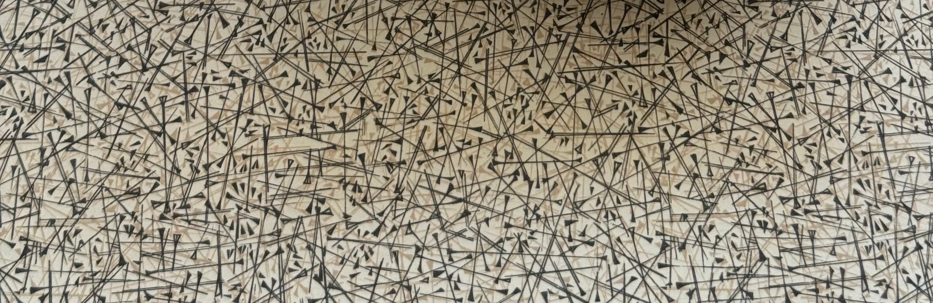
I tracked down some Soviet stuff recently. бумагопластик. Incredibly Mirror World. Proof that they could do industrial production as convincingly as the Americans, but skewed in the aesthetic. Less colour passes. More restrained tones.
This is why the real connoisseurs want the Yugoslavian stuff. Stol Kamnik. Not Western, yet too defiantly independent to ape the Soviet stuff produced in East Germany or Czechoslovakia.
This one’s in two greys and a beige on a cream ground. Partly a spiky space-age abstract, partly barbed wire, or crucifixion nails from some ancient and terrifying religious fresco.
Entirely sui generis. Provoking a pleasurable semiotic dissonance.
Totally Mirror World
Ah the details!! Can't wait to see the book, Tim - and would be fascinated to see some photos of your set-ups.
We have the one we bought when we bought our first flat 30 years ago. It is awful - cheap pine, ugly legs, top moves a bit - but obviously I love it and will be laid out on it when the time comes.